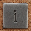


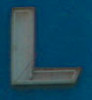
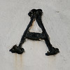


I have just been playing about with a programme which extracts letters from images which have been uploaded to Flickr and lets you make words with them. However, as you can see, I haven't worked out how to make the letters smaller so they fit in one line. Maybe you could follow the link and have a go?
If you do, you will see that you can click on the letters to make them change. Some are definitely better for 'Iceland' than others. For example, here is a version that doesn't seem right.... until you start thinking volcanoes!


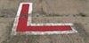
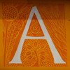
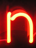

Here's what I managed to produce for 'Puffin'..

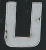




Here are my last two attempts - Iceland in winter and summer. Hopefully it's obvious which is which!

 ...and N.B. the letters are all in one line!
Have a go - it's something to do when it's raining outside.




No comments:
Post a Comment